Full page image and spot for Scientific American Mind.
An image was required to depict how we learn when no one is teaching us - how we make mental maps, how we learn languages, how we come to understand how things work.
Initial thoughts centred around virtual reality and headsets which were referenced in the copy. It was felt that approach made it too specific to a certain approach for simulating the process but didn't get really get across the main idea. Stripping away the tech and making more of a cityscape backdrop was a much better fit and it was that concept that was carried through to finished art.
The spot illustration focused more on how we unconsciously learn from each other.
Cover and full page image for John Hopkins University Arts & Sciences magazine.
I was asked to come up with two related images that would fit the sub-heading of the article: 'Equipping students with the analytical tools they need to navigate through the ethical dilemmas of today—and tomorrow.'
Just the inclusion of the word 'navigation' was enough to generate an idea for the interior illustration which in turn provided the solution for the cover. By using relevant icons to represent the various dilemmas I was able to link the two images together.
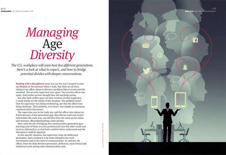
This piece was for the Spring edition of Security Management magazine and was concerned with how to manage communication between generations in the workplace, older employees prefer face-to-face conversations, while younger ones prefer text messaging, iChat etc..
This was an illustration for the Spring edition of forward, the magazine of Iowa State University Foundation.
This cover image was initially to be based on the attempts to control the outbreak of avian flu (as in first sketch above) but later became more focussed on protecting the animal food supply from the effects of the flu. To this end the editors had an image in mind they wanted to use - an ethnically varied team of scientific specialists
I supplied the second sketch above for approval before moving onto the artwork. I wanted it to look quite hard and scientific avoiding anything too soft or cartoon-like. With such a detailed image I elected to use a limited colour palette to create a unified feel.
Rice University's Rice Magazine wanted a cover and interior image to represent the work of David Eagleman, a neuroscientist whose areas of research include time perception, vision, the senses and synesthesia. He is also a Rice alumnus who had a new six-part PBS TV series and book called "The Brain".
While being thought-provoking in their own right, it was requested that the images could sit side by side together by using similar graphic elements and colour palette.
As the major themes include the brain and human senses I came up with the cover idea of taking what could be seen as a conventional head and shoulders portrait and then disrupting it so the viewer would have to look a little closer to ascertain exactly what they were looking at - almost like questioning one's own senses. I felt that was a nice way to reflect the subject matter and one that provided scope for the second illustration. I usually like to keep colour schemes minimal and here we're basically looking at a two colour palette.
The above right sketch was my first thought which then led to the more considered sketch below which was sent for client approval.
These are two initial pencil designs for the interior illustration. Rice preferred the sketch on the left which was then taken to artwork. I continued with the head and shoulders theme, taking the profile view and re-arranging the elements.
The background colour and texture was extended across the spread to accommodate the text introduction to the article.